Colors is the first thing people notice before they read a word. The right card paper and envelope colors can set the mood in seconds, like lighting in a room. The “right” choice isn’t about strict rules, it’s about fit.
Here’s a simple method you can use every time: pick the feeling, choose a cardstock base that supports it, then match an envelope that frames the card.
Start With the Feeling You Want the Card to Send
Begin with mood, then let the occasion confirm it. Warm colors (reds, ambers, cozy browns) feel friendly and welcoming, like a mug of cocoa. Cool colors (blues, teals, blue-greens) feel calm and steady, like a quiet morning. Bright colors (yellows, bold pinks) feel playful and high-energy. Neutrals (ivory, gray, soft white) feel classic, respectful, and safe.
In 2026, a lot of stationery looks clean and simple, with one bold pop and more interest coming from textured paper instead of busy patterns. That’s good news, because it makes color choices easier. Pick one main tone, then let the paper finish do some of the work.
Quick mood guide: warm, cool, bright, and neutral colors
- Comfort: amber, burnished amber, decadent chocolate
- Calm: deep teal, soft blue, blue-green tones
- Joy: banana yellow, sunny yellow, bright coral accents
- Classic: ivory, soft gray, airy white
Choose Cardstock First, Then Pick an Envelope That Frames It
Treat cardstock as the “wall color” of your message. Step one, pick the cardstock color that matches the mood. Step two, choose the finish: matte feels modern, textured feels warm and special, and very smooth can feel more formal.
Step three, pick an envelope that frames the card instead of fighting it. A clean trick is to choose an envelope about 10 percent darker (around 1 to 2 shades deeper) than the cardstock. It makes the card look intentional the moment it’s pulled out. If you want a minimalist look, go same shade, same finish family.
Don’t forget readability. Dark ink on light cardstock is easy on the eyes; save very dark cardstock for short messages and simple designs.
Easy matching rules that prevent clashes
Undertones matter. Warm cream looks best with warm browns and ambers; bright cool white looks best with cool grays and teals. Mixing warm and cool can look “off” unless you repeat both, like a tiny teal icon on a warm ivory card.
Color Pairing Ideas for Common Occasions (with 2026-friendly picks)
Keep pairings simple, then adjust with ink color and a small accent (a seal, liner, or sticker).
Weddings, birthdays, holidays, sympathy, and thank you cards
- Cardstock: ivory, Envelope: soft gray, Feel: calm and elegant
- Cardstock: dusty rose, Envelope: ivory, Feel: romantic and quiet
- Cardstock: banana yellow, Envelope: deep teal, Feel: fun with a modern edge
- Cardstock: bright white, Envelope: decadent chocolate, Feel: bold, grown-up birthday
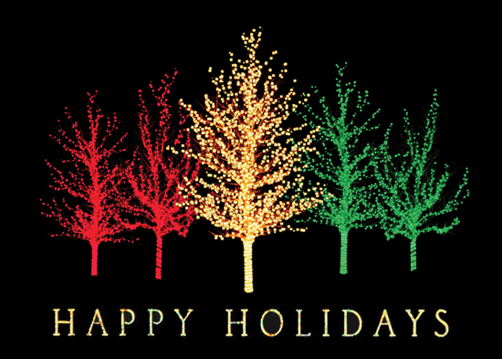
- Cardstock: burnished amber, Envelope: chocolate, Feel: cozy winter holiday
- Cardstock: deep teal, Envelope: ivory, Feel: crisp and seasonal without being loud
- Cardstock: ivory, Envelope: soft gray, Feel: respectful and gentle (skip neons here)
- Cardstock: pale blue, Envelope: gray, Feel: steady and comforting
- Cardstock: airy white, Envelope: deep teal, Feel: clean and confident
- Cardstock: ivory, Envelope: burnished amber, Feel: warm gratitude